We help our clients create space for life.
Aterre Architects
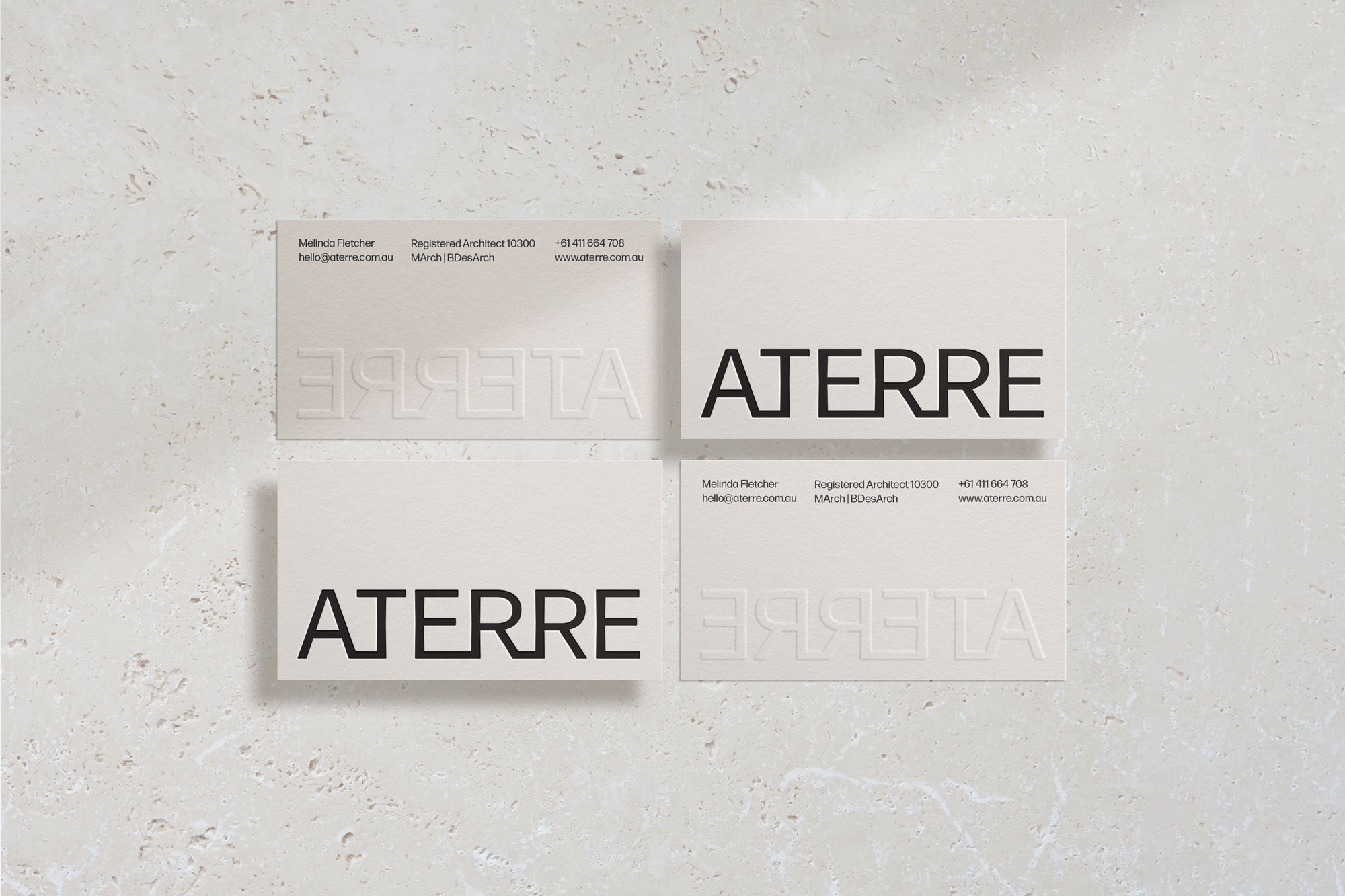
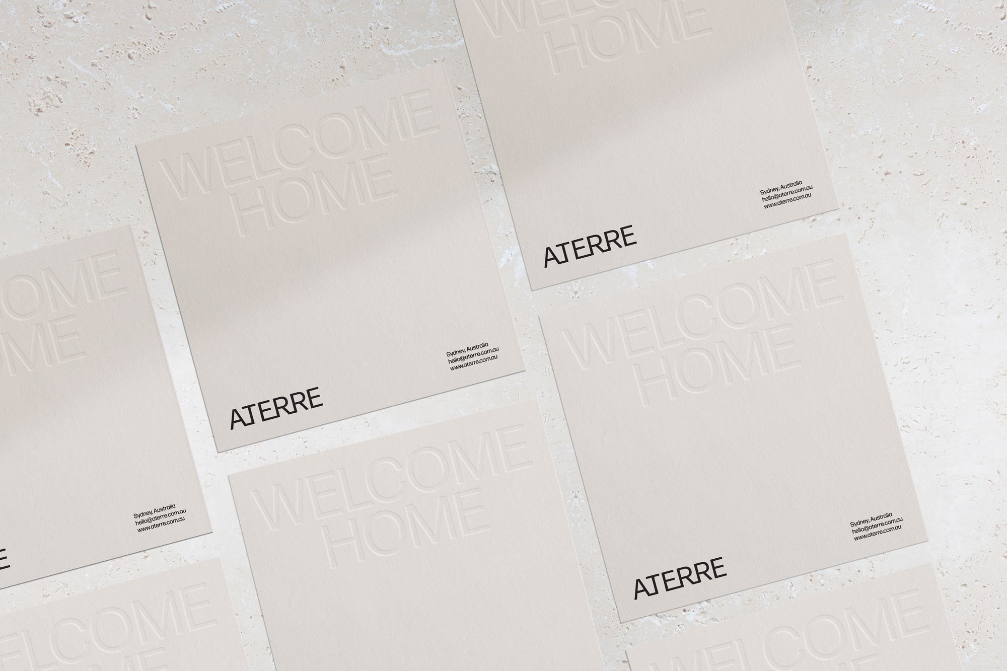
Aterre isn’t just a name — it’s the heart of the brand. Borrowed from Melinda’s ballet background, à terre means “on the ground,” a phrase that speaks to balance, grounding and quiet restraint. It perfectly reflects the way Aterre designs — with clarity, calm and a deep connection to place.
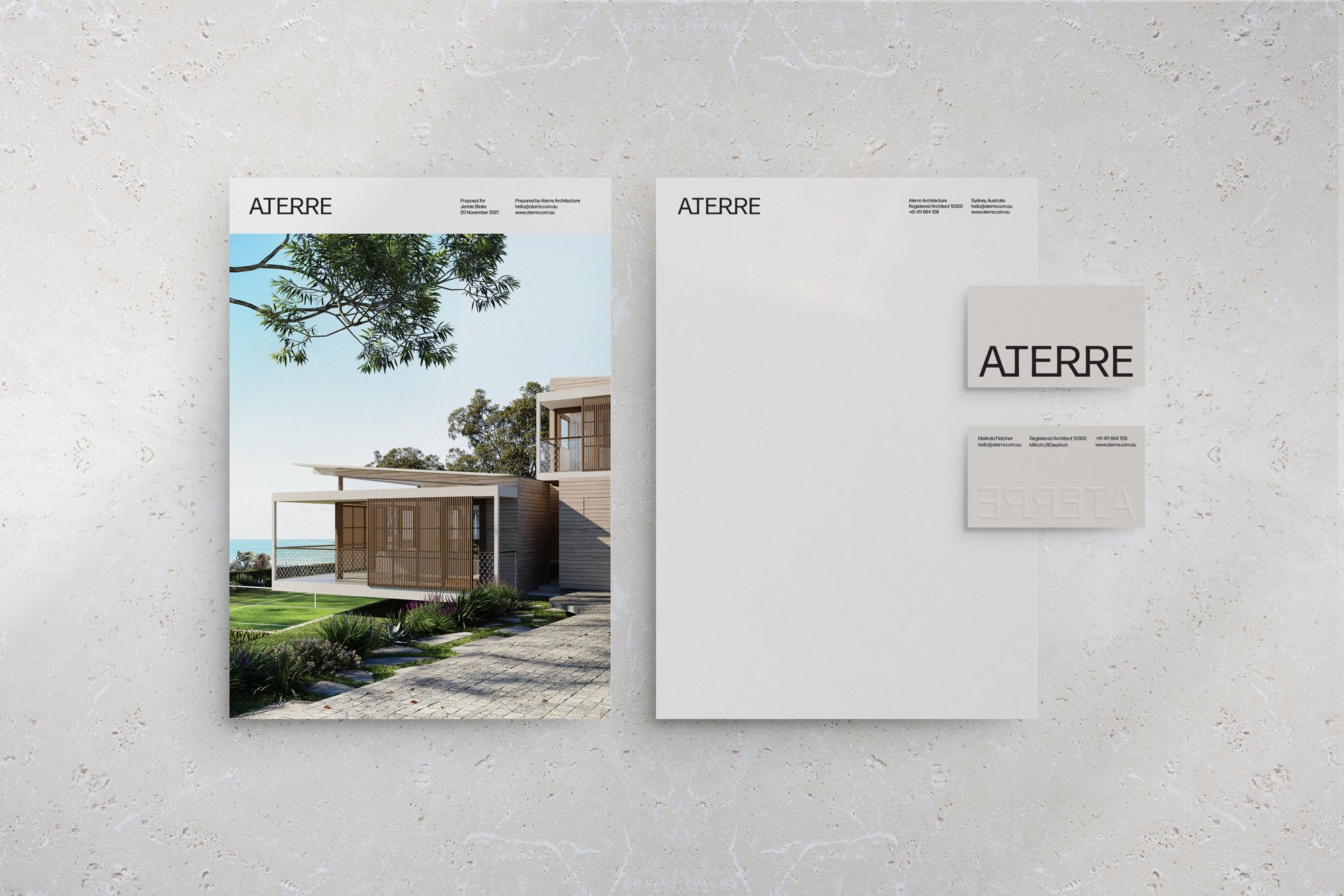
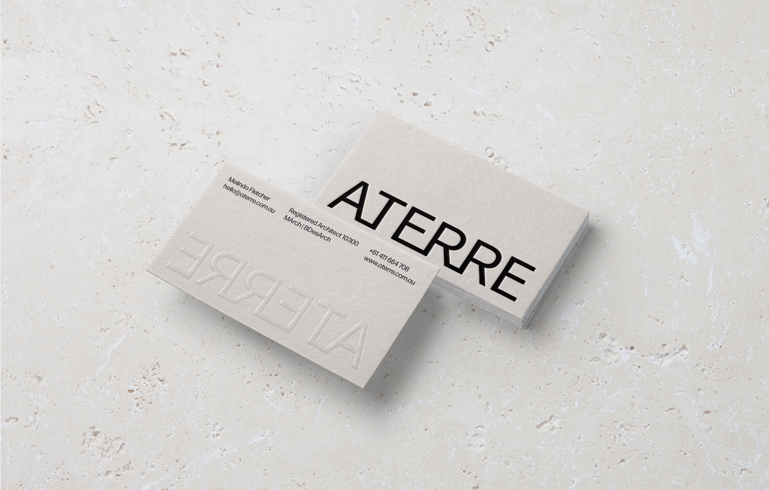
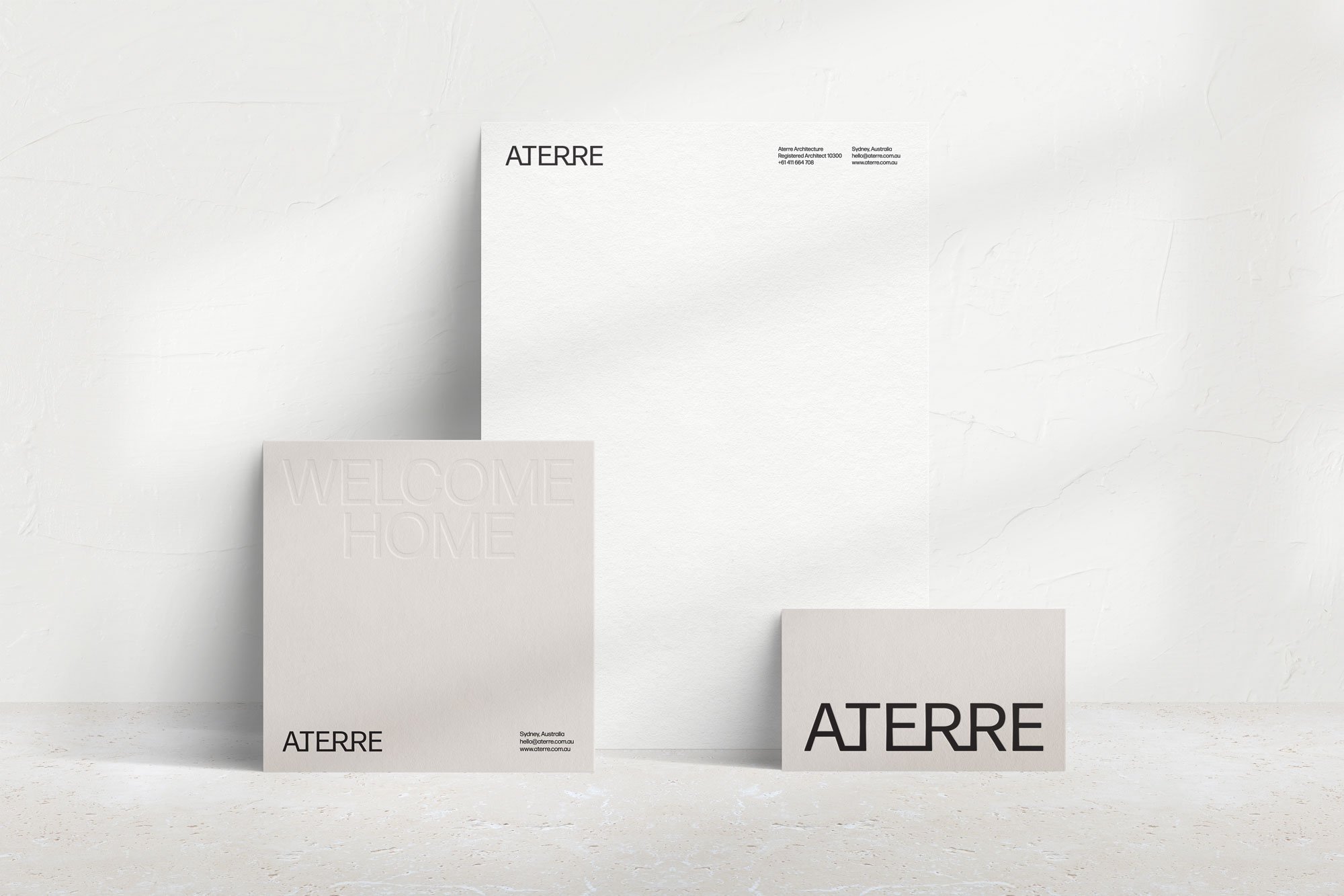
The brand identity was built around this idea. I developed a visual concept that brings the name to life through a custom wordmark, with letterforms subtly connected at the baseline — a nod to structure, movement and stillness. The overall tone is minimal but intentional, allowing the work to speak through space, rhythm and quiet confidence.
Every element is considered and grounded — just like the homes Aterre creates.
“I love that on first glance it looks like a very elegant, simple text logo and then it has the intricate letter connections once you look at it again.” – Melinda, Founder
OVERVIEW
PROJECT SCOPE
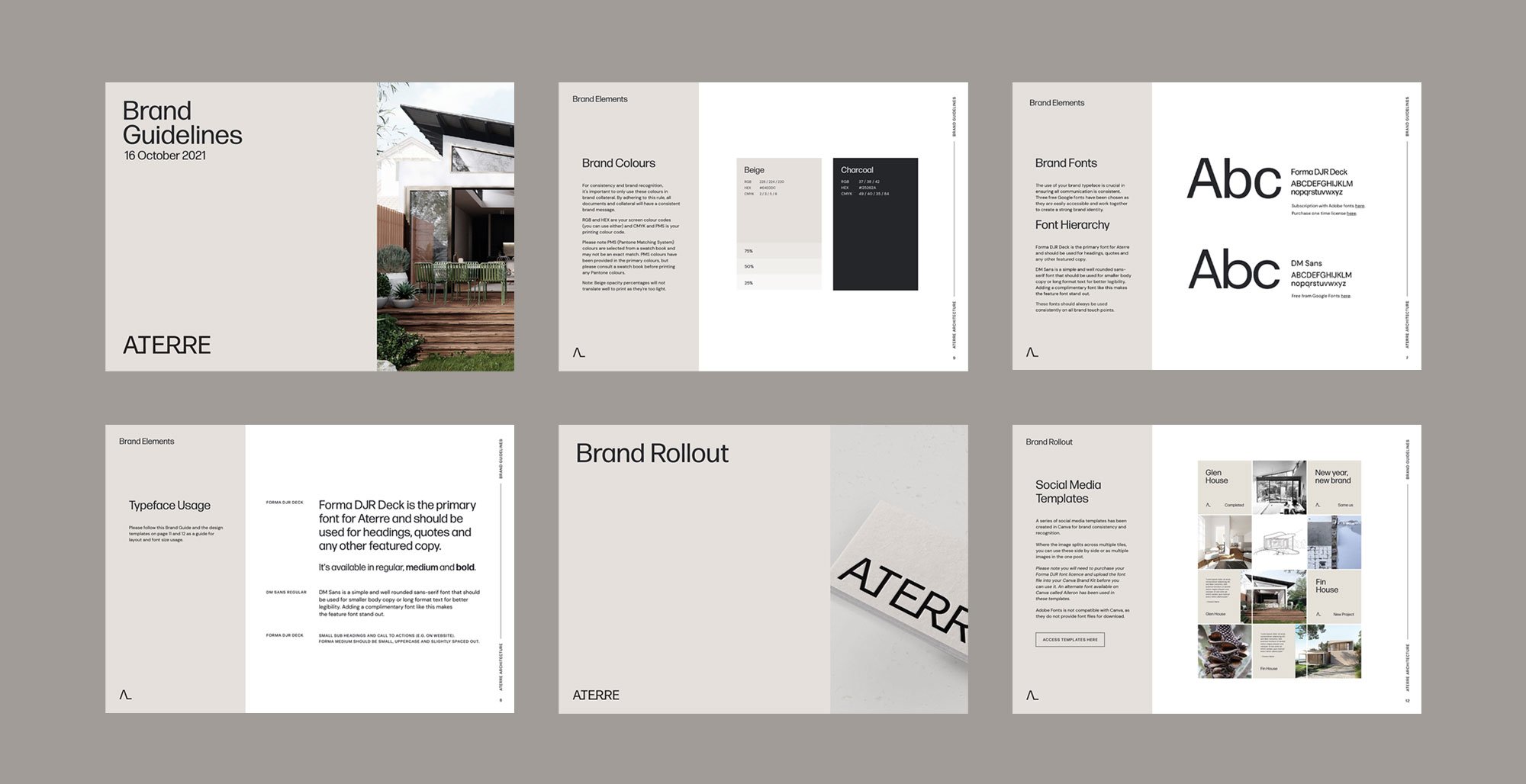
Brand Identity
Collateral Design