Jan Powers
Farmers Markets
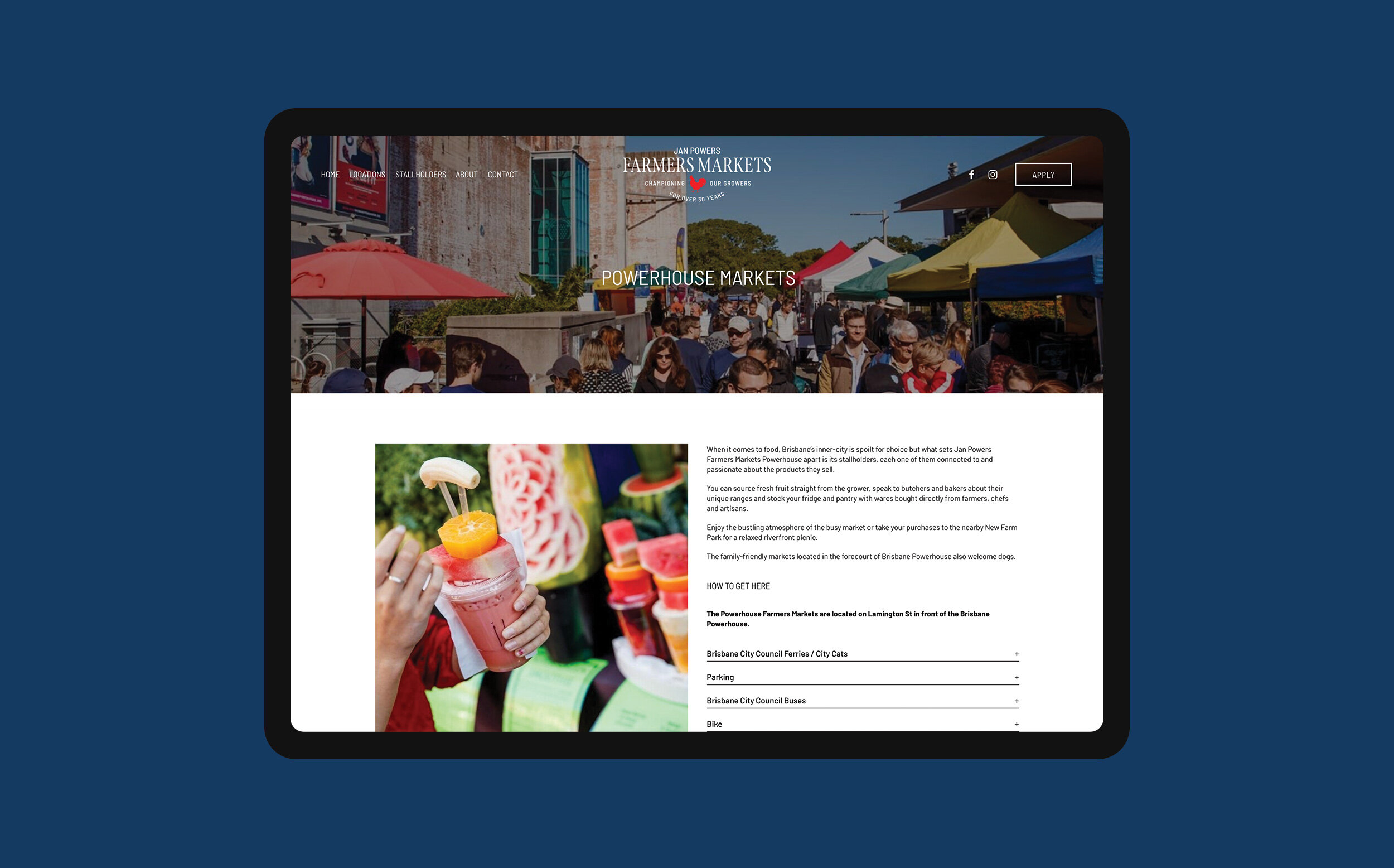
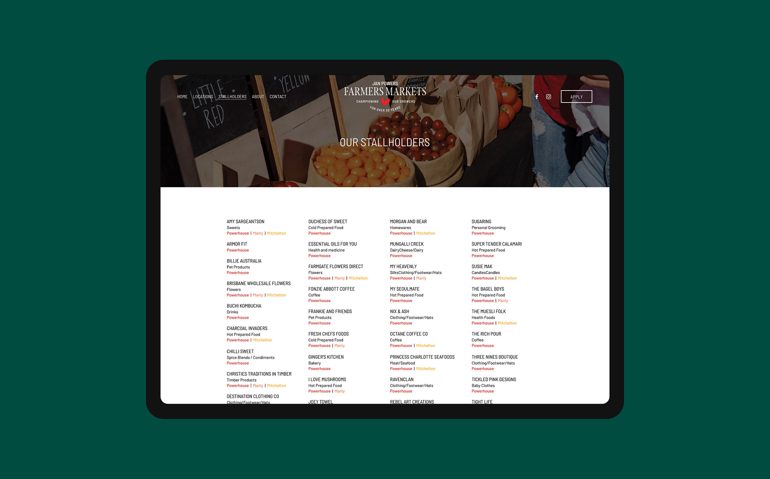
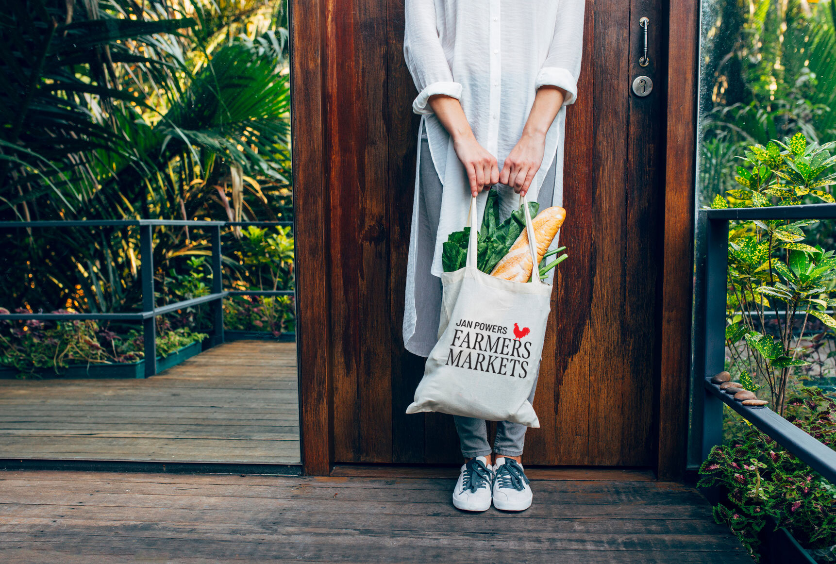
BRANDING + WEBSITE
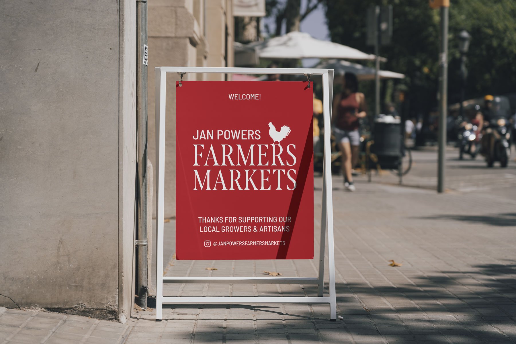
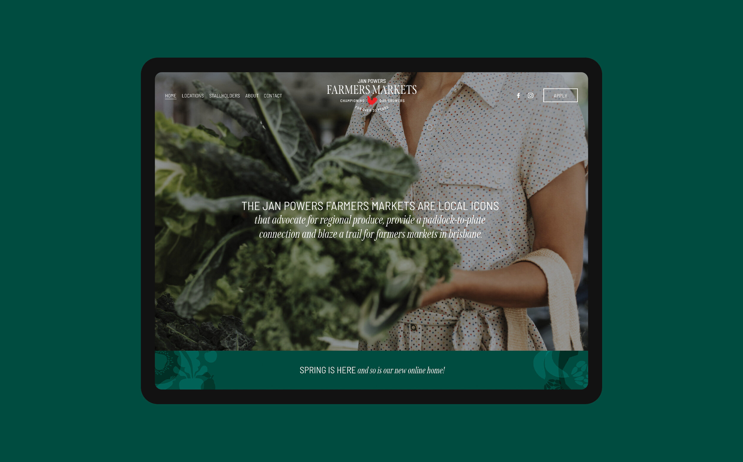
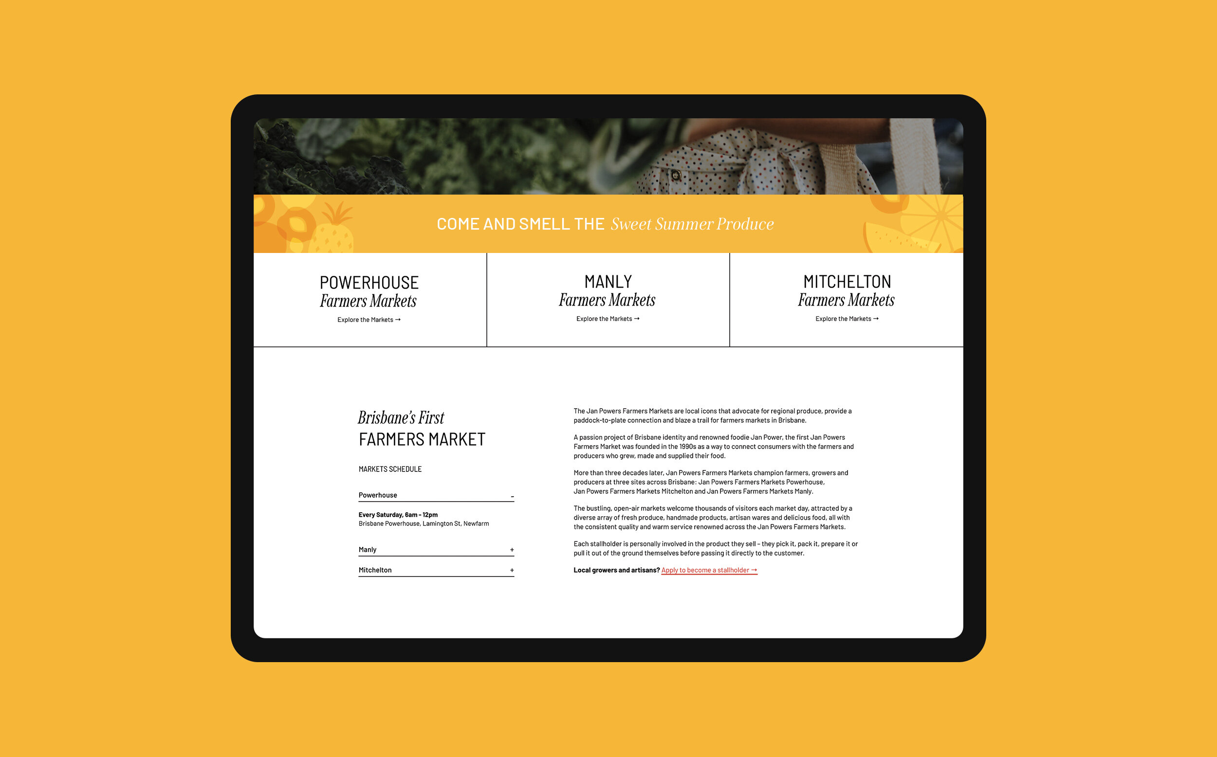
The Jan Powers Farmers Markets are local icons that advocate for regional produce, provide a paddock-to-plate connection and blaze a trail for farmers markets in Brisbane.
They were after a fresh look to cement their legacy as the premium Brisbane farmers market, as they continue to champion local growers and artisans like they have done for 30 years!
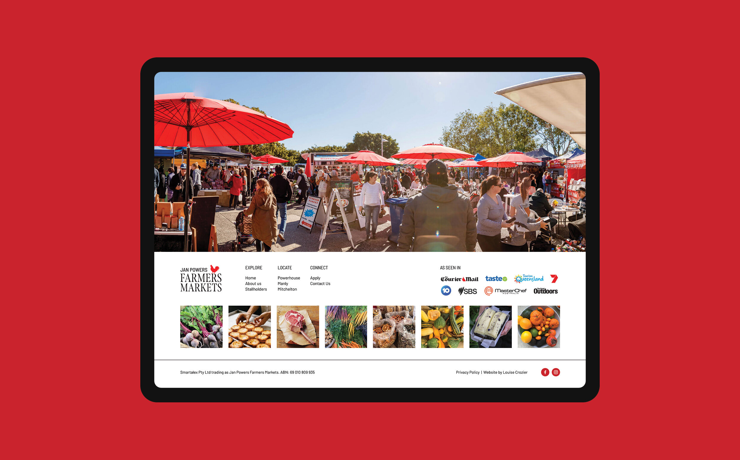
To continue Jan’s legacy and retain her cheeky personality it was important to keep the red colour and rooster icon as part of the rebrand.
“She’s so gorgeous! Thank you for realising this dream for us so beautifully Louise. We are very happy with our new look and have had so much excellent feedback already.”