Aterre Architects
Brand Identity
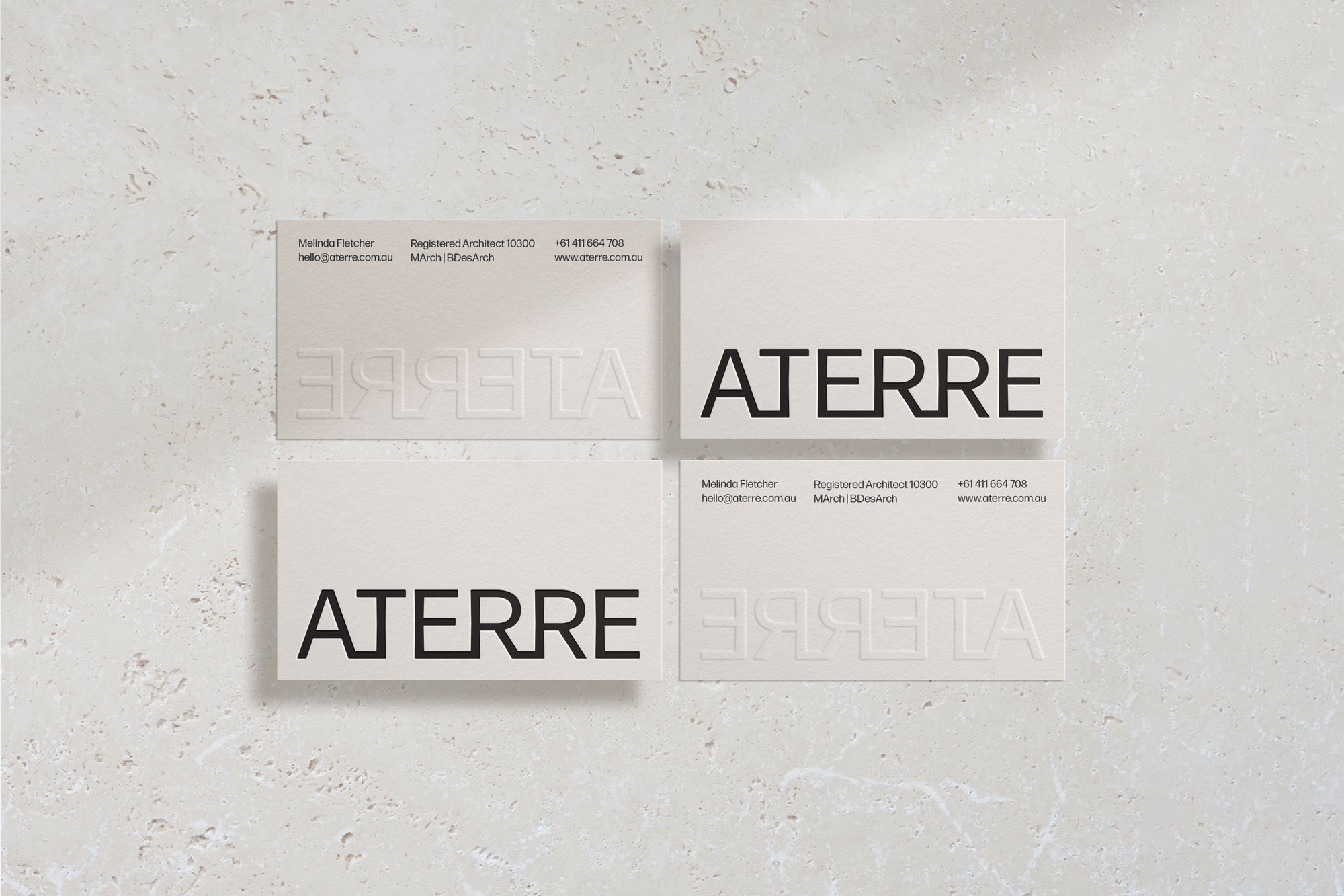
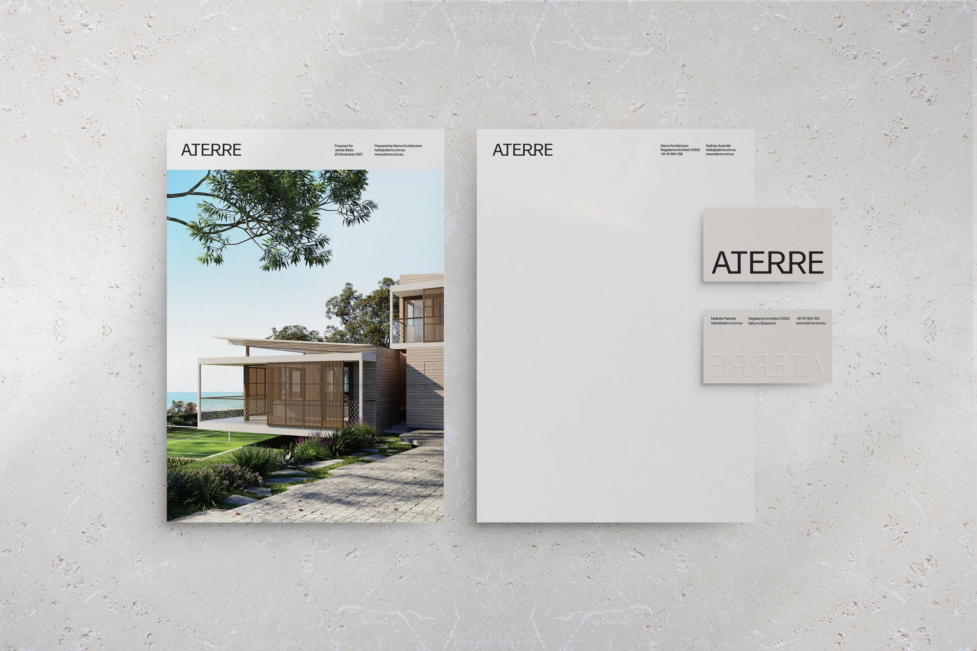
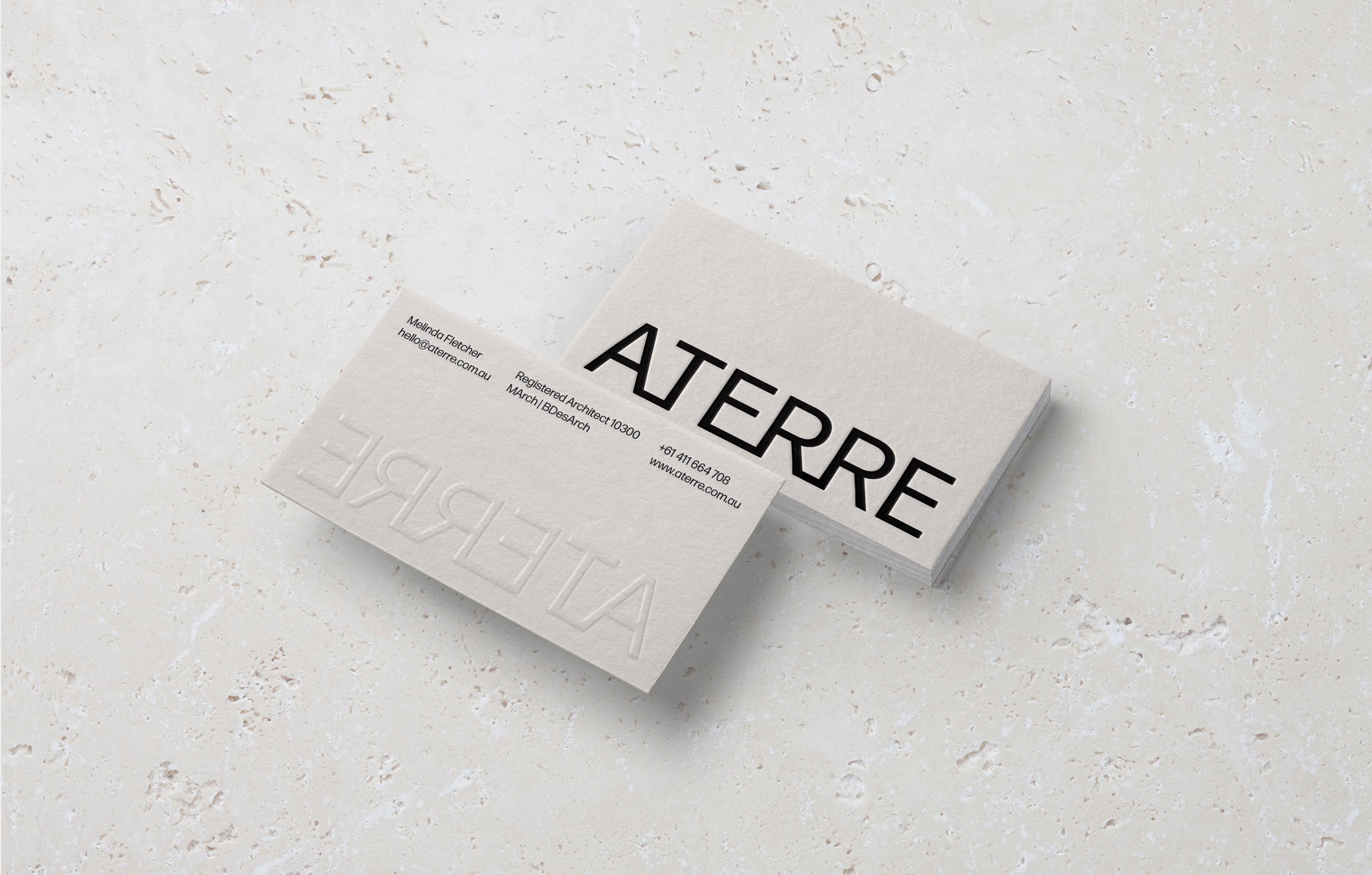
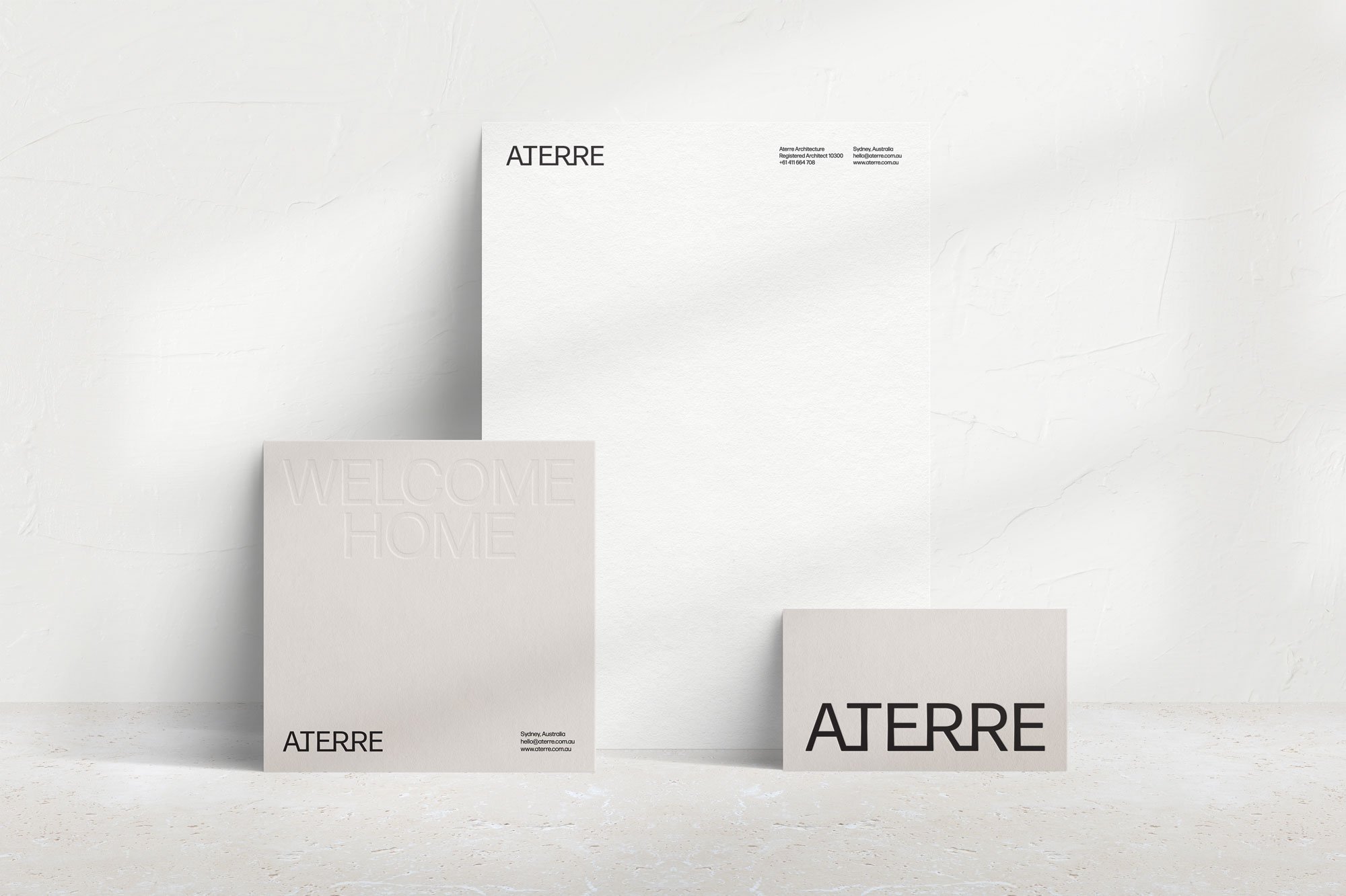
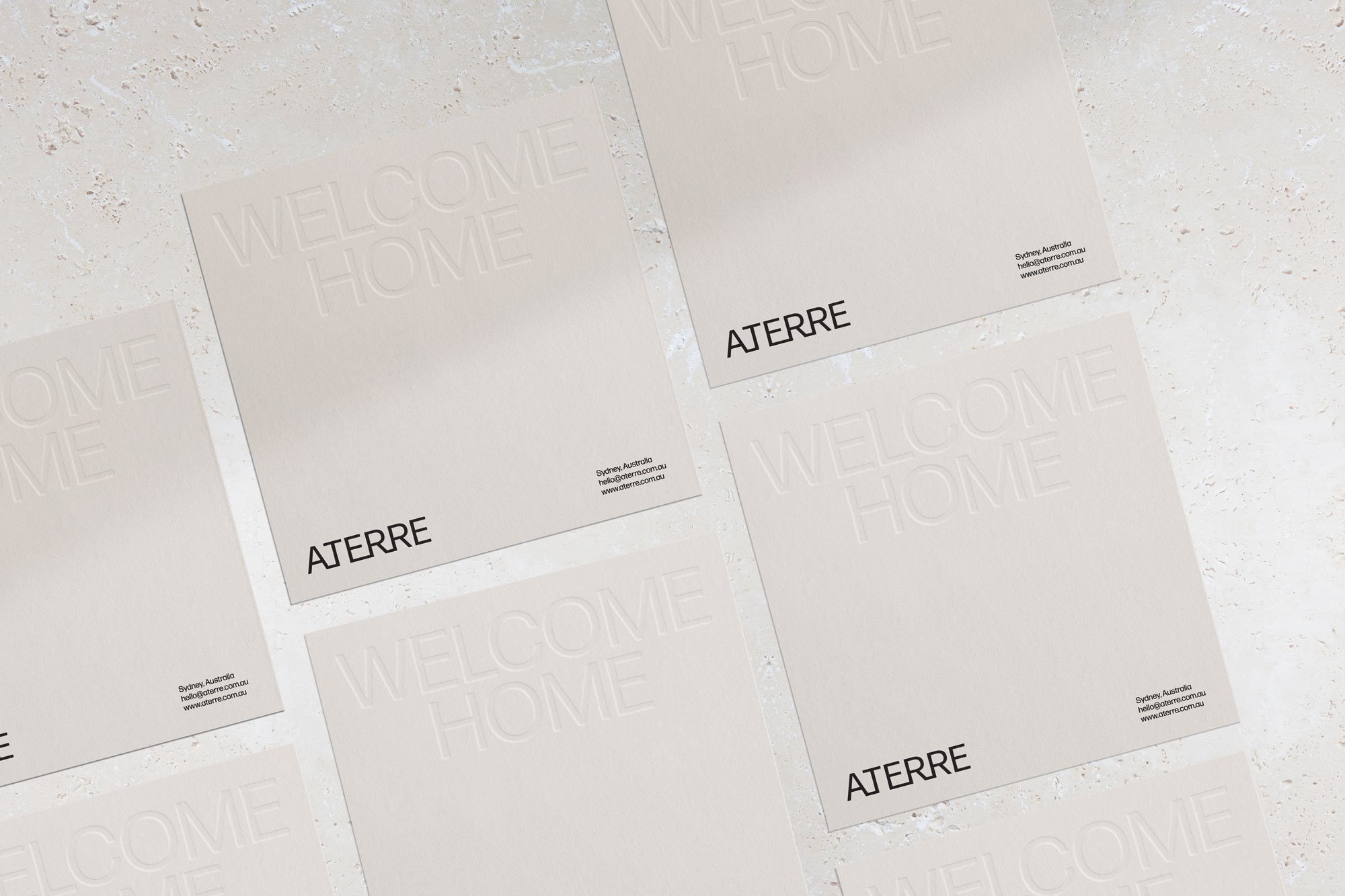
Aterre is a small Sydney based practise specialising in Residential Architecture. They came to us as an existing practice seeking a rebrand and a new name. The brief was to create a simple sophisticated workmark logo that has a sense of unpretentious sophistication.
à terre. adverb Ballet. 1.on the ground.
With the founder having a background in ballet and a connection with the term ‘à terre’, we translated the meaning and gave it a connection to architecture being ‘on the ground’.
“I love that on first glance it looks like a very elegant, simple text logo and then it has the intricate letter connections once you look at it again.”